


LIZARAZU, SOSSA LOZANO & CASTRO
Client Project
BRAND OVERVIEW
Lizarazu Sossa Lozano & Castro is a Colombian law firm built on a foundation of expertise, professionalism, and client trust.
The firm required a modern visual identity capable of reflecting its legal expertise while differentiating itself from the traditional and often generic visual language commonly found within the legal sector.
The project included the creation of a complete brand system and the design of a new website experience aligned with the firm's positioning and long-term growth objectives.
Industry: Legal Services Role: Lead Brand Designer
Deliverables: Brand strategy, logo design, visual identity system, brand guidelines, website design, digital assets, corporate communications, and implementation support.
The resulting identity system became the foundation for the firm's website, digital communications, and client-facing materials, creating a cohesive and professional brand experience across every touchpoint.
TARGET CUSTOMER
A professional audience seeking legal expertise delivered with clarity, integrity, and personalized service.
From business leaders to private clients, trust and confidence are at the center of every interaction.

THE PROBLEM (BRAND PAINS)
As the firm expanded its legal and consulting services, its visual presence no longer reflected the level of expertise, trust, and professionalism delivered to clients.
The challenge was to create a modern identity system capable of communicating credibility, clarity, and strategic thinking while maintaining the firm's established reputation.
Key Challenges
-
Inconsistent visual communication across digital channels
-
Limited differentiation from traditional legal competitors
-
Lack of a scalable system for future growth
-
Need for a more contemporary and approachable digital presence
-
Translating complex legal services into a clear brand experience

INSIGHT
Trust is not communicated through legal terminology alone.
The strongest outdoor brands don't just represent activities; they foster communities.
Clients choose legal partners based on confidence, clarity, professionalism, and the feeling that their interests are being represented by a capable team.
The strongest legal brands balance authority with accessibility, creating confidence before the first consultation even begins.
SOLUTION & CONCEPT
The solution centered on creating a visual identity that communicates the firm's core values: trust, professionalism, stability, and collaboration. At the heart of the system is a custom symbol built around four pillars, representing both the founding partners and the structural foundation upon which the firm is built. More than a graphic element, the mark serves as a visual expression of unity, balance, and collective expertise, reinforcing the idea that every legal process is supported by a strong and coordinated team.
The resulting identity combines institutional credibility with a modern, approachable presence, positioning Lizarazu & Asociados as a trusted legal partner for businesses and individuals alike.
The brand system was designed to support:
• Professional credibility and trust
• Consistent communication across digital and physical touchpoints
• Clear differentiation in a traditional legal market
• Long-term brand recognition and growth
At its core, the identity transforms the firm's values into a recognizable visual language built on structure, partnership, and confidence.
Rather than redesigning a logo in isolation, the objective was to build a complete brand system capable of supporting the firm's website, communications, presentations, and future growth initiatives.

THE BRAND SYSTEM
The visual identity was conceived as a complete brand system rather than a standalone logo redesign. Every component was intentionally designed to work together, creating a consistent experience across digital platforms, corporate communications, presentations, legal documentation, and marketing materials.
By unifying these touchpoints under a single visual language, the system strengthens brand recognition, enhances credibility, and helps position Lizarazu & Asociados as a modern, trustworthy legal partner. The result is a scalable foundation capable of supporting the firm's continued growth while maintaining clarity, professionalism, and consistency at every stage of the client journey.

BRAND IDENTITY
The identity was built around a custom symbol composed of four vertical pillars, representing the firm's four founding partners and the structural foundation upon which the practice was established.
The form communicates:
-
Stability and legal rigor
-
Partnership and collaboration
-
Balance and alignment
-
Long-term trust
-
Institutional strength
The geometric simplicity of the symbol creates a timeless visual language while ensuring flexibility across digital and print applications.
Combined with an elegant serif wordmark, the identity balances professionalism and approachability, positioning the firm as both authoritative and client-focused.

Main Logo

Horizontal Logo

Brandmark
Symbol Rationale
The identity balances structure and fluidity, reflecting the relationship between legal rigor and strategic adaptability.
Geometric forms communicate stability, professionalism, and expertise, while the interconnected composition reinforces collaboration, trust, and long-term client relationships.

The Lizarazu & Asociados color system was designed to communicate trust, professionalism, and long-term stability while maintaining a contemporary corporate presence.
A foundation of deep blues forms the core of the identity, reinforcing the firm's expertise, reliability, and commitment to strategic legal counsel. The progression from dark navy to lighter blue tones creates visual hierarchy and flexibility across digital and print applications while preserving a consistent institutional character.
Supporting neutrals introduce balance and sophistication. The charcoal and gray tones provide structure and authority, while lighter grays and white create clarity, openness, and readability, ensuring that complex legal information remains approachable and easy to navigate.
Together, the palette balances tradition and modernity, reflecting a firm that combines established legal expertise with a forward-thinking approach to client service. The result is a visual system that feels credible, refined, and adaptable across corporate communications, presentations, digital platforms, and branded materials.
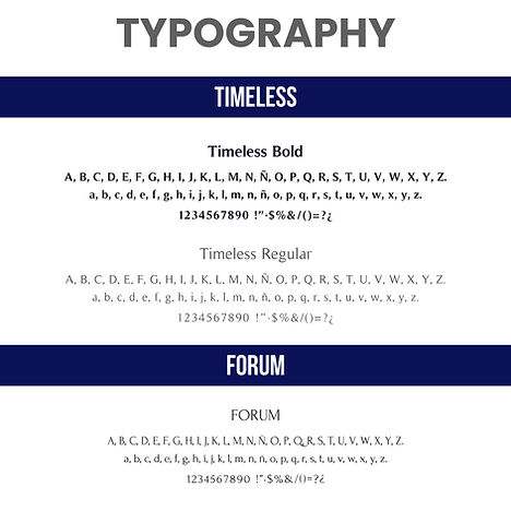
The typography system was intentionally designed around a single primary typeface to ensure consistency, clarity, and recognition across every touchpoint.
Timeless was selected for its ability to balance classic sophistication with contemporary professionalism. Through its carefully crafted letterforms and subtle serif details, the typeface conveys authority, trust, and stability while maintaining excellent readability across headlines, subheadings, and body copy. This unified approach creates a cohesive visual voice that reinforces the firm's credibility across both digital and printed communications.
To provide additional flexibility in web environments and specific design applications, Forum was established as a complementary alternative. Its elegant and highly legible character allows it to integrate seamlessly with the identity while preserving the refined and professional tone of the brand.
Together, these choices support a clear, trustworthy, and timeless visual language aligned with the firm's values and long-term positioning.
ICONOGRAPHY
The iconography system was developed as a custom navigation and communication tool rather than a decorative asset library. Each icon represents a specific legal practice area, translating complex services into clear, recognizable visual cues.
Instead of relying on generic legal symbolism, the system combines industry-specific references with a consistent geometric structure, allowing clients to quickly identify areas of expertise while maintaining a cohesive brand experience.
From antitrust and consumer protection to intellectual property, litigation, public services, and technology law, every icon was designed to balance clarity, professionalism, and usability across both digital and print applications.
Together, the system transforms a broad portfolio of legal services into an organized, accessible, and user-friendly experience.

MESSAGING & TONE OF VOICE
The brand voice was designed to communicate expertise with clarity, balancing professionalism and authority with accessibility and trust. Across every touchpoint, the messaging emphasizes strategic guidance, confidence, and long-term client relationships while making complex legal topics easier to understand.

GRID SYSTEM • LOGO CONSTRUCTION


The logo was developed using a precise grid system that establishes consistent proportions, spacing, and alignment across all variations. This structured approach reinforces the firm's commitment to accuracy, clarity, and professional excellence while ensuring scalability across every application.
BRAND SYSTEM + WEBSITE EXPERIENCE BUILT FOR LONG-TERM GROWTH
THE SYSTEM IN PRACTICE
The Lizarazu & Asociados brand system was implemented across a wide range of digital and professional touchpoints, creating a consistent experience throughout the client journey.
Applications included the corporate website, practice area navigation, custom legal service iconography, digital communications, presentations, marketing materials, social media assets, and internal brand resources.
By combining a scalable visual identity with a structured content framework, the system helps communicate complex legal expertise with greater clarity, consistency, and credibility across every interaction.
The result is a professional brand ecosystem that supports both business development and long-term brand recognition while remaining flexible enough to grow alongside the firm.


APPAREL
APPAREL
The website was designed as the firm's primary client acquisition and communication platform.
The new identity was translated into a clean, accessible digital experience that prioritizes clarity, trust, and usability while reinforcing the firm's professional positioning.
The identity continues to support the brand across its digital presence and customer-facing touchpoints.
Visit the live website → https://lizarazuasociados.com/
EXPLORE MORE BRAND SYSTEMS
One methodology. Unlimited brand possibilities
 HumanizeICTTechnology |  Social FishingOutdoor Lifestyle |
|---|---|
 Mrs Greenfield'sHealthy Food |