


SOCIAL FISHING
Client Project
BRAND OVERVIEW
Social Fishing is Australia's largest freshwater fishing community, connecting anglers through educational content, podcasts, memberships, events, and merchandise.
Founded around a shared passion for freshwater fishing, the brand has grown into a thriving community where enthusiasts learn, connect, and share their adventures on and off the water.
As the community expanded across digital and physical touchpoints, founder Rhys approached me to redesign the visual identity and create a cohesive brand system capable of supporting future growth while preserving the authenticity that made Social Fishing so beloved.
The result was a scalable brand ecosystem spanning digital experiences, memberships, content, and merchandise.
Industry: Outdoor Recreation & Media Role: Brand Designer & Art Director
TARGET CUSTOMER
Social Fishing serves anglers who value not only fishing itself, but the knowledge-sharing and sense of belonging that come with being part of a community. Audience Profile:
-
Recreational and competitive anglers
-
Outdoor enthusiasts aged 25–50
-
Community-driven learners seeking tips, gear, and experiences
-
Fishing enthusiasts looking to connect with like-minded people

THE PROBLEM (BRAND PAINS)
As Social Fishing expanded its presence across multiple channels, its visual ecosystem had grown organically over time, resulting in inconsistencies across touchpoints.
The challenge was to create a unified identity system that could support an ever-growing community while maintaining the rugged, authentic spirit of freshwater fishing culture.
Key challenges included:
-
Fragmented visuals across web, podcast, merchandise, and social media
-
A lack of standardized assets for future content creation
-
Multiple logo variations without a cohesive system
-
The need to modernize the brand while preserving its outdoor authenticity
-
Ensuring consistency across both digital and physical experiences
The objective wasn't simply to redesign a logo, it was to create a scalable brand system capable of supporting future growth.

INSIGHT
Fishing is more than a hobby, it's a lifestyle rooted in exploration, storytelling, and belonging.
The strongest outdoor brands don't just represent activities; they foster communities.
This insight became the foundation of the redesign: positioning Social Fishing not merely as a fishing resource, but as "YOUR FRESHWATER COMMUNITY", a place where anglers connect through shared experiences and a passion for the outdoors.
Rather than relying solely on fish imagery, the visual language was built around movement, water, adventure, and connection.
SOLUTION & CONCEPT
The solution was a flexible and scalable brand system designed to unify every touchpoint of the Social Fishing experience.
Inspired by rivers, movement, and outdoor exploration, the refreshed identity balances rugged authenticity with modern digital usability.
The system was intentionally designed to support:
-
Content creation at scale
-
Community engagement
-
Membership experiences
-
Sponsorship opportunities
-
Merchandise expansion
At its core, the redesign reinforces Social Fishing's role as a trusted hub for freshwater anglers.

THE BRAND SYSTEM
A comprehensive ecosystem of assets was developed to ensure consistency across platforms while allowing flexibility for future growth.
Core Identity Assets: primary logo, logo variations, URL, URL logo, horizontal lockups, stacked lockups, black & white versions, one-color variations, membership badges and identifiers, podcast identity system, and brand guidelines.

Digital Assets: website graphics, community banners, social media templates, testimonial templates, and promotional graphics.
Apparel System: hoodies, T-shirts, caps, sublimated jerseys, long-sleeve performance apparel.
The new identity system became the foundation for Social Fishing's website, podcast, membership platform, social content, and apparel program, creating a more cohesive experience across the community ecosystem.
In total, the project generated over 100 brand assets and variations designed to support long-term consistency and efficient content production.
BRAND IDENTITY
The Social Fishing identity was designed to capture the essence of freshwater fishing culture while reinforcing the brand's role as a thriving community hub.
At the heart of the system is a custom symbol built around the letter "S", transforming the brand initial into a multifunctional mark that blends symbolism and utility.
The form simultaneously evokes:
-
A fishing hook, representing the sport itself
-
The letter "S" for Social Fishing
-
Movement and flow inspired by rivers and water currents
-
Connection points that symbolize community, shared experiences, and learning
Encased within a circular structure, the mark communicates continuity, belonging, and the cyclical nature of outdoor adventure, reinforcing the idea that Social Fishing is more than a platform: it is YOUR FRESHWATER COMMUNITY.
Built to perform across digital platforms, merchandise, and community experiences.

Main Logo

Horizontal Logo

Brandmark

URL

Membership Badge

Podcast
Adaptive Identity
The brand system was intentionally designed to function across a diverse ecosystem of touchpoints, including websites, podcasts, social media, memberships, and apparel.
Multiple lockups, including primary, horizontal, URL-based, badge, and podcast variations, ensure visual consistency while adapting seamlessly to different contexts and formats.
The result is a flexible identity system that scales with the community while maintaining instant recognition both online and in the outdoors.
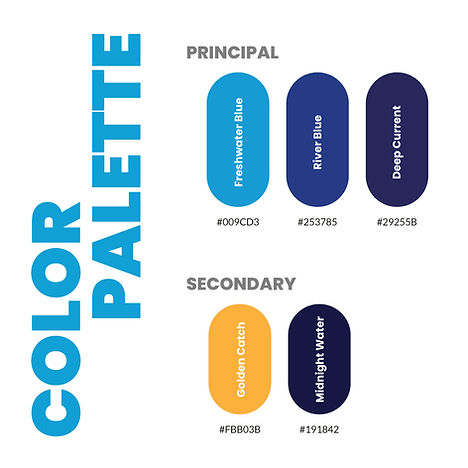
The Social Fishing color system draws inspiration directly from freshwater environments and the emotional experience of life outdoors.
A hierarchy of blues forms the foundation of the identity, reflecting water, depth, trust, and exploration. The vibrant cyan introduces energy and movement, echoing sunlight on the water and creating strong visibility across digital experiences. Progressively darker blues add stability, expertise, and a sense of adventure while ensuring flexibility across multiple applications.
Strategic warm accents in amber provide contrast and visual emphasis, functioning as a beacon for key interactions, highlights, and moments of achievement within the community.
The result is a palette that balances rugged outdoor authenticity with modern digital clarity, equally effective on screens, apparel, print materials, and environmental graphics.

The Social Fishing typographic system balances rugged outdoor energy with clarity and accessibility across digital and physical experiences.
Bebas Neue was selected for headlines and key messaging, bringing strength, confidence, and high visibility across apparel, banners, social media, and promotional materials.
Supporting it, Open Sans provides excellent readability for websites, educational content, membership platforms, and mobile experiences.
Together, the pairing creates a hierarchy that feels both dynamic and approachable, capturing the excitement of outdoor exploration while supporting the educational and community-driven nature of the brand.
The typographic system was intentionally built to scale across multiple touchpoints, ensuring consistency from podcast graphics and social content to merchandise and web interfaces.
ICONOGRAPHY
The iconography system extends the Social Fishing identity into a flexible visual language inspired by freshwater adventures. Featuring gear, navigation, camping, and fishing elements, the icons reinforce the brand's educational and community-driven spirit.
Built with consistent line weights and geometric proportions, the system ensures recognition and scalability across digital platforms, merchandise, and printed materials.


Together, these icons transform everyday fishing experiences into a cohesive visual ecosystem that supports exploration, learning, and connection.
MESSAGING & TONE OF VOICE
The Social Fishing brand was built around a voice that feels authentic, adventurous, educational, and community-driven.
At the heart of the system is the promise: "YOUR FRESHWATER COMMUNITY", a space where anglers can learn, connect, and share their passion for life on the water.
From podcast content to memberships and social media, every touchpoint was designed to reinforce trust, exploration, and a shared sense of belonging.

GRID SYSTEM • LOGO CONSTRUCTION


The grid system brings structure and consistency to the identity, ensuring every element remains aligned, scalable, and instantly recognizable across any format.
100+ BRAND ASSETS DEVELOPED ACROSS DIGITAL AND PHYSICAL TOUCHPOINTS
WHERE THE SYSTEM COMES TO LIFE
The Social Fishing brand system was implemented across a wide range of real-world experiences, including:
Website graphics and digital experiences, podcast covers and promotional materials, membership badges and identifiers, Facebook and YouTube banners, social media templates, community marketing assets, and hoodies and performance apparel
Many of these assets continue to live across the Social Fishing ecosystem today, demonstrating how a scalable brand system can support long-term growth and community engagement.
By building a scalable system rather than isolated deliverables, the brand is equipped to evolve alongside its growing community.


APPAREL
APPAREL
APPAREL
The apparel system extended the brand into real-world experiences, transforming members into ambassadors of the community both on and off the water.


The new identity improved consistency across touchpoints and provided Social Fishing with a scalable foundation for future growth across content, memberships, and merchandise.
Selected elements of this identity remain in use today.
Visit the live website → https://socialfishing.com.au/
EXPLORE MORE BRAND SYSTEMS
One methodology. Unlimited brand possibilities
 TAKI TAKIRestaurant |  LSLCCorporate Law |
|---|---|
 CadaVinci StudioBrand Systems |