


TAKI TAKI
Self-Initiated Branding Project
BRAND OVERVIEW
TAKI TAKI is a playful, egg-focused breakfast brand built around one simple idea: breakfast without limits. Designed for modern urban lifestyles, the brand blends speed, accessibility, and a bold visual identity to deliver an experience that feels both fun and consistent.
With a strong emphasis on all-day availability, TAKI TAKI breaks traditional meal boundaries, offering comforting, egg-based options whenever customers want them. Its vibrant aesthetic, centered around a cute and memorable egg character, creates an approachable and distinctive brand presence across physical and digital touchpoints.
TARGET CUSTOMER
TAKI TAKI is designed for families and food lovers who value convenience, consistency, and enjoyable food experiences. Its audience includes young professionals, students, and casual diners looking for a reliable spot to grab quality breakfast at any time of day.
The brand also appeals to visually-driven consumers who appreciate clean, modern design and shareable food moments, making it naturally aligned with social media culture.
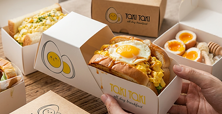
THE PROBLEM (BRAND PAINS)
Most food brands compete visually. They rarely compete strategically.
Breakfast is defined by time. And that’s the problem.
Most breakfast brands are built around a fixed moment of the day, morning.
Which means they limit themselves before even communicating.
In a market full of predictable visuals and repetitive concepts, the challenge was not just to stand out, but to break the logic behind how breakfast is positioned.
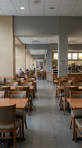
INSIGHT
What if breakfast wasn’t tied to time at all?
Instead of competing within the same “morning” space, the opportunity was to remove time as a constraint, and turn breakfast into something flexible, playful, and available anytime.
SOLUTION & CONCEPT
Breakfast, without limits. Designed as a system.
TAKI TAKI removes time as a constraint, turning breakfast into an all-day behavior rather than a fixed moment.
To make this idea tangible, the brand is built around a simple but powerful element: the egg.
Not as a symbol, but as a character system capable of expression, variation, and personality.
This allows the brand to communicate consistently while remaining playful and adaptable; transforming a single ingredient into a dynamic identity.
A scalable, character-driven brand system that transforms breakfast into a recognizable, all day experience!
THE BRAND SYSTEM
A character-driven system.
At the core of the identity is the egg, used not as decoration but as a flexible communication tool.
-
The character adapts across contexts, expressing different moods, moments, and uses
-
Color supports variation and energy across the system
-
Typography reinforces clarity while maintaining a playful tone
-
Layout provides structure, allowing the character to evolve without losing consistency
Together, these elements create a system that feels alive, capable of shifting across the day while staying recognizable.

BRAND IDENTITY
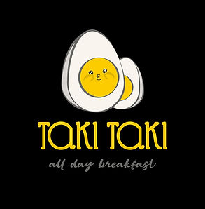
The TAKI TAKI logo is built around a dual-purpose concept: the egg as both product and personality.
As a core ingredient, the egg immediately anchors the brand within the breakfast category, ensuring instant recognition. Simultaneously, its transformation into a character introduces an emotional layer, allowing the brand to connect with customers beyond functionality.
This balance between literal meaning and emotional storytelling strengthens memorability and brand affinity.
Symbol Design • Functional Character
The egg icon is intentionally designed to operate as a character-driven asset without losing graphic clarity:
-
The simplified silhouette ensures strong recognition at any scale.
-
The soft, rounded geometry communicates comfort, warmth, and accessibility—key attributes for a breakfast brand.
-
The kawaii-inspired facial expression adds personality while remaining subtle enough to avoid infantilizing the brand.
-
The slight irregularity in linework introduces a human touch, avoiding the rigidity of overly digital marks.
Importantly, the symbol is not decorative—it is strategic: it enables storytelling, merchandising, and brand recall across multiple touchpoints.
Main Logo
Horizontal Logo

Wordmark
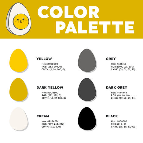
The palette is directly inspired by the product itself, using egg-derived tones as a strategic color anchor:
-
The warm yellow tones act as both a visual hook and an appetite stimulant, conveying energy, positivity, and freshness.
-
The neutral whites and greys provide balance, ensuring the system remains clean, modern, and highly adaptable.
-
The restrained palette allows the brand to feel vibrant without becoming overwhelming, maintaining consistency across environments.
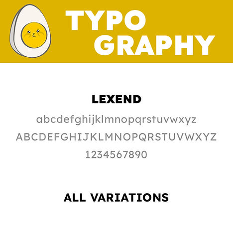
The typography was chosen to work in direct dialogue with the egg character:
-
Rounded shapes mirror the circular yolk geometry
-
Smooth curves echo the organic fluidity of egg forms (runny, soft, melted)
-
Stroke consistency aligns with the illustration outline weight
This creates a cohesive system where type and icon feel designed together, not assembled
CHARACTER SYSTEM
The TAKI TAKI character is not a single static mascot, but a modular identity system built around the egg in multiple states.
This decision allows the brand to:
-
Expand visually without losing consistency
-
Represent its product range in a literal yet playful way
-
Maintain long-term flexibility across campaigns, packaging, and digital content
Rather than creating different characters, the system evolves one core identity across variations, reinforcing recognition while enabling storytelling.


Core Consistency Across Variants
All character variations share a fixed visual DNA:
-
Same facial structure and expression language
-
Consistent line weight and outline style
-
Unified color palette (yolk yellow, soft whites, warm highlights)
-
Repeated kawaii-inspired emotional cues (eyes, blush, mouth)
This ensures that regardless of the preparation (fried, scrambled, poached, etc.), the character is always instantly recognizable as TAKI TAKI.
The key principle: variation without fragmentation
Emotional Range & Brand Personality
The variations introduce subtle differences in mood while maintaining coherence:
-
Puffy / soft shapes → comfort and warmth
-
Glossy yolk textures → joy and indulgence
-
Slight expression shifts → friendliness, curiosity, satisfaction
This expands the brand from a logo into a living personality system, aligned with the tone of voice: “a playful friend”

Visual Differentiation Strategy
In a crowded food category, most brands rely on photography alone. TAKI TAKI introduces:
-
A distinctive illustrative layer
-
A recognizable character-driven system
-
A balance between graphic simplicity and emotional richness
This positions the brand as: approachable + designed + memorable
Long-Term Scalability

The system is inherently expandable:
-
New menu items → new character variations
-
Seasonal campaigns → themed adaptations
-
Limited editions → collectible-style assets
This transforms the character into a scalable branding tool, not just a mascot.
One ingredient, multiple personalities, a CHARACTER SYSTEM that turns the menu into identity.

MESSAGING & TONE OF VOICE
TAKI TAKI speaks like a playful friend: light, witty, and approachable. Its tone embraces humor through wordplay and egg-inspired puns while remaining clear and friendly.
The brand avoids being overly childish or overly polished, striking a balance between fun and confidence. It communicates with warmth and simplicity, making customers feel welcome, understood, and slightly entertained with every interaction.
GRID SYSTEM • LOGO CONSTRUCTION
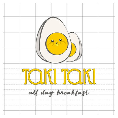

The logo is built on a structured grid system to ensure visual balance, alignment, and scalability across all applications.
-
The grid defines proportional relationships between the icon, logotype, and tagline
-
It guarantees consistent spacing, alignment, and optical harmony
-
It allows the logo to be reproduced accurately at any size or format
The result is a mark that feels playful in expression, but precise in construction, reinforcing both the emotional and professional qualities of the brand.
THE IDEA REMOVES THE LIMIT
THE CHARACTER MAKES IT VISIBLE
THE WORLD OF TAKI TAKI
Designed to behave across moments.
The system allows the brand to move fluidly across different contexts: morning, afternoon, or night; without relying on a fixed visual formula.
The character system ensures continuity, while the overall structure maintains clarity and recognition across every touchpoint.


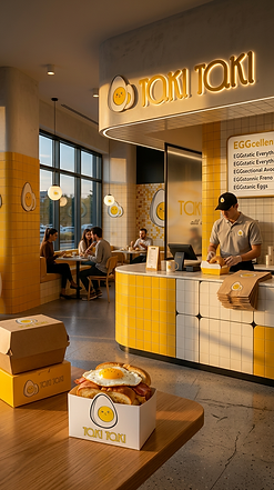
PACKAGING


RESTAURANT PREMISES • LOOK & FEEL DESIGN
The spatial design translates TAKI TAKI’s brand identity into a physical experience through color, form, and light.
-
A dominant warm yellow palette reinforces product association (egg/yolk) and brand recall
-
Rounded geometries and soft edges echo the logo and character system
-
Clean, minimal materials balance playfulness with a contemporary, premium feel
-
Warm ambient lighting (day-to-night) supports the “All Day Breakfast” concept
The result is a space that feels coherent, inviting, and instantly recognizable, where branding and environment operate as one unified system.

EXPLORE MORE BRAND SYSTEMS
One methodology. Unlimited brand possibilities
 Mrs Greenfield'sHealthy Food |  Social FishingOutdoor Lifestyle |
|---|---|
 RAVERZElectronic Music |