


MRS GREENFIELD'S
Self-Initiated Branding Project
BRAND OVERVIEW
Mrs Greenfield’s is a premium salad bar concept built around freshness, simplicity, and everyday wellness. The brand blends clean aesthetics with an approachable tone, creating a modern space where healthy eating feels effortless and desirable.
Designed for urban lifestyles, it delivers high-quality, customizable meals through a refined yet accessible visual identity, where minimalism, natural color palettes, and thoughtful details communicate trust, balance, and freshness.
TARGET CUSTOMER
Mrs Greenfield’s speaks to urban professionals aged 25-40 and wellness-driven individuals who value both health and efficiency.
They are design-aware, time-conscious, and intentional about what they consume. Whether between meetings or after a workout, they seek food that aligns with their lifestyle: fresh, customizable, and visually appealing without feeling complicated or exclusive.

THE PROBLEM (BRAND PAINS)
Healthy food is often positioned as a sacrifice.
In most brands, nutrition comes first, resulting in identities that feel clean, minimal, and correct, but rarely exciting.
The experience becomes functional, not emotional.
Healthy food ends up feeling like something you should choose, rather than something you want.
Healthy food shouldn’t feel like a compromise. It should feel like a reward!

INSIGHT
People don’t crave what feels restrictive. They crave what feels rewarding.
To make healthy food more appealing, the perception needs to shift, from obligation to desire, from discipline to enjoyment.
SOLUTION & CONCEPT
Healthy, but irresistible.
Mrs Greenfield’s is designed to reposition healthy food as something vibrant, inviting, and genuinely desirable.
Instead of reinforcing the typical “clean and minimal” aesthetic, the brand introduces warmth, richness, and personality, creating an experience that feels accessible, enjoyable, and visually appetizing.
Healthy food is no longer framed as a limitation, but as something people actively look forward to.
From functional and forgettable: to curated, desirable, and consistent.

THE BRAND SYSTEM
A system built around appetite and accessibility.
-
Color enhances freshness while increasing visual appeal and warmth
-
Typography balances clarity with a friendly, inviting tone
-
Layout creates rhythm and richness, avoiding sterile compositions
-
Imagery emphasizes abundance and variety, not restriction
Every element works together to make the brand feel open, desirable, and easy to choose.

BRAND IDENTITY
The identity of Mrs Greenfield’s is built around a single, cohesive intention: to position healthy eating as something that is both refined and effortlessly accessible. Every element of the logo works together to express this balance, avoiding the common extremes of the category, either overly organic and unstructured, or excessively premium and distant.
The symbol/Brandmark combines a bowl and a leaf into a single, minimal gesture that communicates both fresh ingredients and customization.
Rather than illustrating a literal salad, the form is intentionally reduced to its essential shapes:
-
The bowl establishes a clear category anchor (food / salad bar)
-
The leaf inside the bowl introduces a dual reading: ingredient + content
This creates a flexible metaphor: the bowl is constant, but what goes inside is personal.
The asymmetry and slight irregularity of the leaf avoid a sterile or overly geometric feel, reinforcing a sense of natural authenticity without losing control.
This idea is reinforced through the typographic treatment, where structure and softness coexist. The letterforms are intentionally restrained yet slightly organic, creating a controlled warmth that feels curated rather than designed for effect. This allows the brand to remain approachable without losing clarity or precision, key for a concept that operates in both physical and fast-paced contexts.

Main Logo

Horizontal Logo

Brandmark
Composition & Logo System • Flexibility Without Losing Identity
The logo is designed as a modular system, not a single lockup:
-
Primary vertical version: brand presence
-
Horizontal version: functional adaptability
-
Brandmark: compact applications (icons, patterns, micro branding)
This ensures scalability across: Packaging • Interior signage • Digital environments
While maintaining consistent visual recognition through: fixed symbol proportions, stable color relationships and predictable spacing logic

The palette is built around greens, but not in a generic “organic brand” way.
Instead, it uses a hierarchy of greens:
-
Vibrant green: freshness, energy, ingredient cue
-
Dark greens: structure, depth, trust
-
Cream green: softness, balance, background neutrality
This creates a controlled visual system:
Fresh, but not loud
Natural, but not raw
The inclusion of neutral gray further stabilizes the palette, preventing visual fatigue and reinforcing a premium, composed aesthetic.

The typographic system is built on a deliberate contrast between structure and neutrality.
Anton is used for headlines to establish a strong, confident presence with high legibility and impact, reinforcing clarity and immediacy in communication.
Montserrat, used for body text, introduces balance through its clean, highly readable forms. Its neutral and contemporary character ensures versatility across applications while maintaining a subtle warmth that aligns with the brand’s approachable tone.
Together, both typefaces create a cohesive system where hierarchy is clear, communication is efficient, and the overall aesthetic remains clean, modern, and controlled.
PATTERNS
A modular pattern language that translates freshness into a consistent and recognizable visual system.


Mrs Greenfield’s is designed to make freshness feel structured, and customization feel effortless, through a visual system that balances natural cues with intentional design.
MESSAGING & TONE OF VOICE
The tone of voice is clean, friendly, and quietly confident.
It avoids exaggeration and complexity, focusing instead on clarity, warmth, and authenticity. The language is simple yet intentional, inviting without being casual, premium without being distant.
Every message reflects balance: natural, modern, and human.

GRID SYSTEM • LOGO CONSTRUCTION


The grid brings clarity and balance to the identity, ensuring everything feels aligned, consistent, and easy to apply across any format.
HEALTHY SHOULD FEEL LIKE A REWARD
THE BRAND IN EVERYDAY MOMENTS
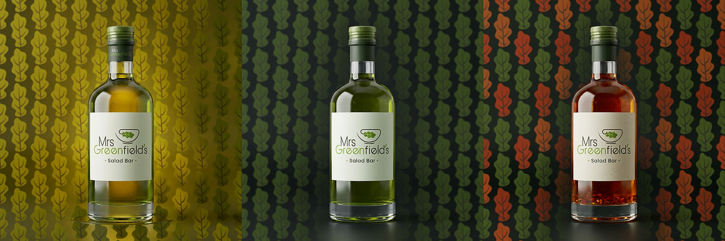
Designed to attract, not instruct.
Across packaging and communication, the identity focuses on creating an immediate sense of appeal, making healthy food feel approachable, satisfying, and enjoyable at first glance.
The goal is not to explain why it’s good, but to make people want it instantly.


WHERE THE MESSAGE MEETS THE CUSTOMER


RESTAURANT PREMISES • LOOK & FEEL DESIGN
The space translates the brand into a cohesive physical experience where freshness feels intentional and structured.
A controlled palette of soft greens, light woods, and neutral tones creates a calm and welcoming atmosphere, while the brand’s leaf-based patterns are subtly integrated across surfaces to reinforce recognition and visual continuity without overwhelming the space.
Natural materials are balanced with clean lines and clear layouts, allowing the environment to feel both approachable and refined. The result is a space that supports the product experience: fresh, customizable, and effortless, while maintaining a consistent sense of quality and clarity across every touchpoint.


EXPLORE MORE BRAND SYSTEMS
One methodology. Unlimited brand possibilities
 TAKI TAKIRestaurant |  Social FishingOutdoor Lifestyle |
|---|---|
 CadaVinci StudioBrand Systems |